
City of Lethbridge unveils new ‘Gateway to Opportunity’ brand
By Dale Woodard on June 23, 2021.
 Herald photo by Dale Woodard
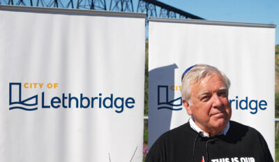
Mayor Chris Spearman stands in front of banners displaying new logos during an event unveiling updated branding for the City of Lethbridge held Tuesday at the Helen Schuler Nature Centre.
Herald photo by Dale Woodard
Mayor Chris Spearman stands in front of banners displaying new logos during an event unveiling updated branding for the City of Lethbridge held Tuesday at the Helen Schuler Nature Centre.Lethbridge is the Gateway To Opportunity.
And now the city has the brand to back it up.
On the 112th anniversary of the completion of Lethbridge’s High Level Bridge, the City of Lethbridge is combining its past with the future with a new brand, helping build community pride while attracting new visitors, investors, businesses, students and residents.
“What this stylized, updated logo and image talks about is Lethbridge as a modern city, a city that offers promise, hope and opportunity for all who live here,” said Lethbridge mayor Chris Spearman at the official unveiling Tuesday morning at the Helen Schuler Nature Centre. “It’s an exciting day today because we have this new logo which has a lot of symbolism for the City of Lethbridge. You can see under the style-ized ‘L’ the water, which is so important to our city and our area, the irrigation and the water that creates life in the city.
“We’ve had the symbol or the crest of the City of Lethbridge that has existed for over 100 years. It needed to be updated. One of the things I’m most proud of is there’s a saying in Latin underneath the crest and it meant ‘Gateway To Opportunity’, but nobody knew what it was and, in fact, Lethbridge is the gateway to opportunity. There aren’t many cities of 100,000 that have a university and a college and a diverse economy. We are a great place for new Canadians to come to and refugees to come to and for graduates from institutes of higher learning.”
Tara Grindle, corporate communications manager for the City of Lethbridge, said the design process has been about a year-and-a-half in the making.
“We’ve put in a lot of effort, thought and research behind it,” she said. “The whole idea behind the branding was to make sure we’re presenting a city that is attracting residents. We want to be able to attract students here and attract investors, businesses and new residents and have something we can feel proud about as a community and as our staff as well.”
The visual aspects of the brand combine the elements of a progressive city with local perspectives while tying in the movement of the Oldman River located in the heart of Blackfoot territory, all working together to tell the City of Lethbridge story.
The logo has three elements that come together to form the ‘L’, said Grindle.
“The top part of the ‘L’ being a city, that progressive city. The section coming out of the ‘L’ shows that forward-looking perspective. It mimics our roads, our pathways and it mimics the bridge, that perspective going forward. The little swoop underneath is the water and the river and the movement, also a tie-back to the traditional Blackfoot lands.”
The familiar City Crest, created in 1907, will remain an important part of the organization.
Its use will return to its original intent – the official Coat of Arms for the Mayor and City Council. All other communication from the City will transition to the new branding when it makes operational and financial sense to do so.
“The (old) crest isn’t going away, but you’re going to see the stylized City of Lethbridge (brand) appearing on city vehicles and stationary,” said Spearman. “It’s going to be a gradual transition and we’re very mindful of cost at this time. But we’re launching this together with community partners and saying ‘This is what Lethbridge is about’. We’re inviting people to be part of it. We see it as a more exciting image than just a crest by itself. The crest has some historical value that we just don’t want to discard, but we want to update it. We’re still going to keep the old crest which will sit in city council meetings, but it’s talking about progression and how we move forward. We’re not stuck in 1909.”
Grindle said the City worked with a graphic design agency out of Edmonton called the Met Agency – who put in a Request For Proposals bid – in designing the new brand.
The creation of the City of Lethbridge corporate brand was built on strong community and stakeholder research already completed through the development of the Lethbridge community brand in 2018.
“We were able to leverage a lot of the research that was already done in the community brand that we did in 2018,” she said. “Council had put money toward something called Intelligent Communities. One of the pillars of an Intelligent Communities is marketing and advocacy. So they had worked with a brand agency out of Vancouver to create the community brand, which is Brighter Together. We wanted to take all of that research that has already been done, we didn’t have to start from scratch, and that was really the jumping off point for us to do this smartly and economically.
The new branding and implementation will be completed using existing budgets and will not have any financial impact on taxpayers.
“We’re only going to do this where it makes financial and operational sense to do it,” said Grindle. “It’s not going to be throwing out every crest that exists out there and replacing it because that doesn’t make any sense. That crest is still going to be a part of our history and that official seal for mayor and council.”
Grindle said the City’s website and social media started posting updates Tuesday.
“Over the next while we’ll phase in new decals on our fleet and things like that and it will be a progression from there. It will take time. It’ll probably take several years until we find all the crests that are out there. But we’ll do it when it makes sense to do it.”
For more resources and to learn more about the story of the new City of Lethbridge brand visit http://www.lethbridge.ca/branding.
Follow @dwoodardherald on Twitter
3-2
